"kawara" is a website builder provided as a WordPress plugin that makes it easy for anyone to create a website. We wanted a UX and UI design that would be easy to use and intuitive, even for older people who are not used to technology.

When aiming for a design that anyone can use and finds easy, what elements make the design look "easy"? From research and interviews, I have found that from a functional and emotional standpoint, there are two key points to consider, each listed below.
Functional aspect:
An intuitive UI that allows users to feel that they are in control of the tool
Emotional aspect:
A reassuring design that does not cause stress or difficulty
To meet the requirements of the functional aspect, specifically, I made it a rule to design transitions and behaviors that do not go against user expectations and to write active expressions.
To meet the requirements of the emotional aspect, I proposed using a color palette with roles set for each color and illustrations to reduce difficulty, as well as accessibility considerations.
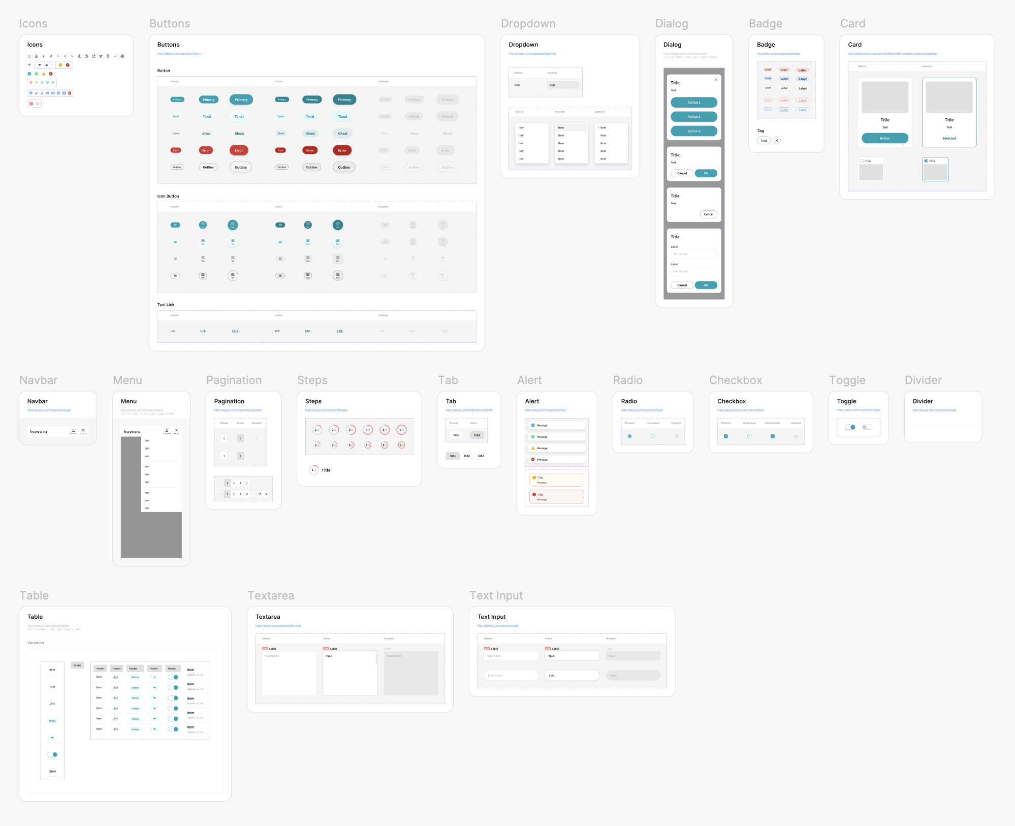
Considering these, I made the concept of "gentle design." The primary color is teal. The bluish-green gives an impression of safety while also being fresh and young. As for the typeface, I adopted the one with wide internal space, which has a relaxed look and is easy to read.


I first built a style guide and component library and then proceeded to design the UI, following the rules established in the guidelines.
